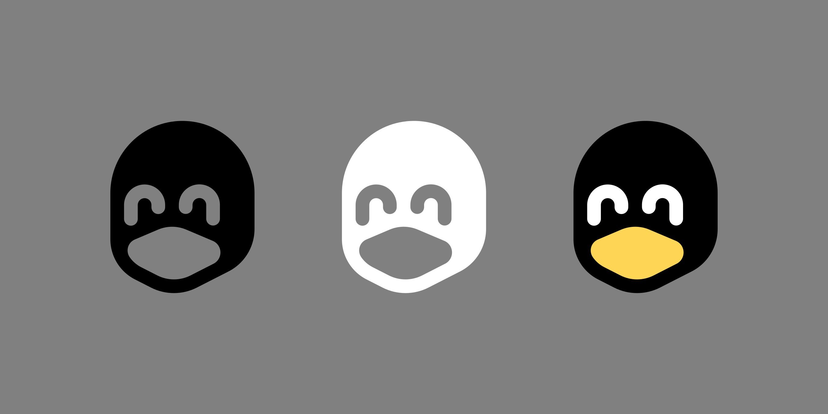
I could see something like this being a common use icon, it's very well done. I prefer this look to having the big bodied Tux on a small icon, this solves the problem well. Good job!
Linux
From Wikipedia, the free encyclopedia
Linux is a family of open source Unix-like operating systems based on the Linux kernel, an operating system kernel first released on September 17, 1991 by Linus Torvalds. Linux is typically packaged in a Linux distribution (or distro for short).
Distributions include the Linux kernel and supporting system software and libraries, many of which are provided by the GNU Project. Many Linux distributions use the word "Linux" in their name, but the Free Software Foundation uses the name GNU/Linux to emphasize the importance of GNU software, causing some controversy.
Rules
- Posts must be relevant to operating systems running the Linux kernel. GNU/Linux or otherwise.
- No misinformation
- No NSFW content
- No hate speech, bigotry, etc
Related Communities
Community icon by Alpár-Etele Méder, licensed under CC BY 3.0
Why is the white one happiest? Shit, am I a racist?
The black one has open o_o eyes but the white one has closed ^_^ eyes
I think these either need the beak to be a bit irregularly shaped or needs a black line inside the beak to make it more clear this isn't just a big hole in the face but an actual bird beak.
But other than that its great! And that's of course just my personal opinion, you do you!
I personally think it looks fine, seems to look like a happy penguin to me
the middle one llok like a robber mask
i did go overkill with the simplification, so its easy to see other things. but at small sizes i feel it works better.
I LOVE these! Great work!
Those look nice!
Have you considered a Creative Commons license, maybe with the BY-SA (Attribution-ShareAlike) terms?
