this post was submitted on 11 Feb 2024
0 points (NaN% liked)
Data Is Beautiful
6700 readers
2 users here now
A place to share and discuss data visualizations. #dataviz
(under new moderation as of 2024-01, please let me know if there are any changes you want to see!)
founded 3 years ago
MODERATORS
you are viewing a single comment's thread
view the rest of the comments
view the rest of the comments

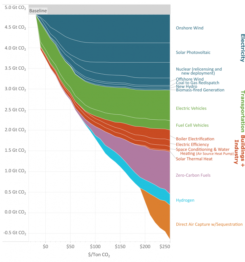
If you need a video to explain your graph, is it really that good of a visualization?
I thought it was beautiful
I do think it’s beautiful, indeed. There are some meaningful colours piled up forming a column