Photon

143 readers
8 users here now

Photon for Lemmy

An alternative UI for Lemmy with more features, a more intuitive UX, and modern design.

Share your themes, ask questions, report bugs, or check on the latest updates here!

founded 10 months ago
MODERATORS
1
1
submitted 5 months ago* (last edited 4 months ago) by [email protected] to c/[email protected]


Photon has been fully localized and you can translate it to your native language now! (will not be released until v1.30)

You can help translate at the Weblate

If you need help, you can join Photon Translators Matrix room.

Ask for as many clarifications as you need.

Requirements

  • Be fluent in the language you're translating to.
  • No Google translate or other translation tools, as they are often inaccurate without context.
2
1
Failed to fetch the page (discuss.tchncs.de)
submitted 5 months ago* (last edited 5 months ago) by [email protected] to c/[email protected]


I have an issue with proton. I hosted the software on my own homeserver with portainer.

Often it comes the failure "TypeError: NetworkError when attempting to fetch resource."

when i try to upload images

or

when I try to post something

in photon. It doesnt work in Firefox (Mac) or Safari (iOS, MacOS).

The instance is not the problem. It works with voyager.

3
1
submitted 5 months ago* (last edited 5 months ago) by [email protected] to c/[email protected]


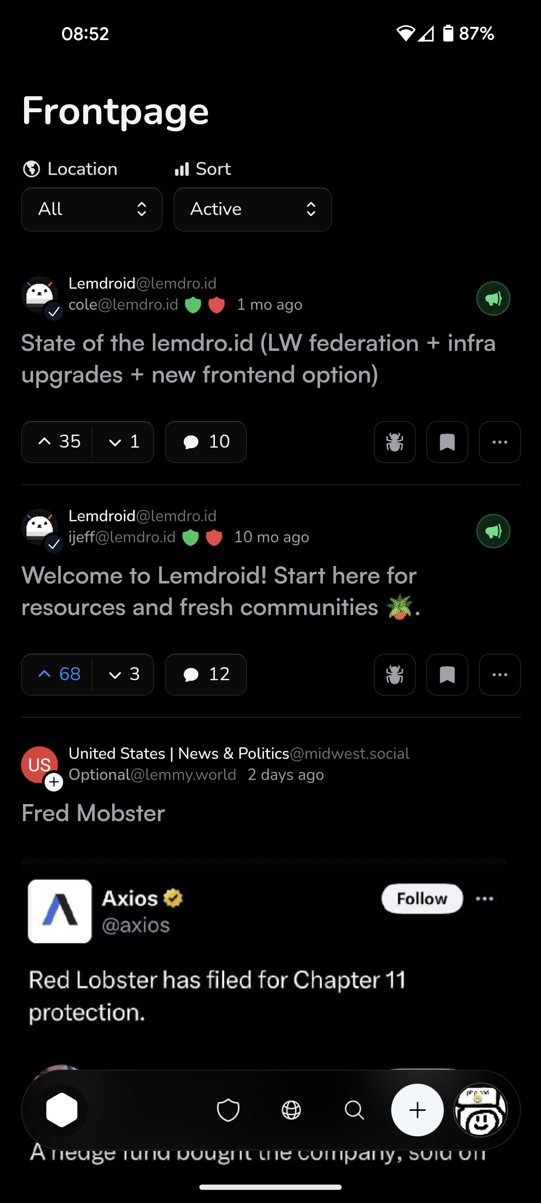
This is great on OLED screens, the background is true black and darker colors are used in many spots. Orange is the accent color to not burn your eyes with blue light, but you can change it.

{"other":{},"primary":{"900":"#000000"},"zinc":{"900":"#0a0a0a","925":"#000000","950":"#000000"},"slate":{}}
4
1
submitted 5 months ago* (last edited 5 months ago) by [email protected] to c/[email protected]


New stuff

  • Revert the positions of most navigation buttons (Home on left, profile on right)
  • Add "adaptive" options to dock settings
    • This will make the dock's position (top, bottom, floating or not) change based on your screen size (it is now the default)
    • So on mobile, you'll have a bottom, floating dock but on desktop a top panel

Fixes

  • Add autofocus to search bar #319
  • Don't hide titles on iframes #317
  • Add refresh button to inbox page #313
  • Dock covers sidebars as a top panel
  • Add maxlength to password form #312
5
1
submitted 5 months ago* (last edited 5 months ago) by [email protected] to c/[email protected]


Update: Photon v1.29.4 has addressed these concerns. Let me know what you think here

It seems the navigation is widely disliked by many people. I want Photon to be the most intuitive UI, so I'd like to fix this. Which of these should I do?

A - Revert the positions of the items on the navigation bar (Profile on right, home on left)

B - Have the default navigation be top on desktop

C - Move some things out of the profile menu into the navbar.

D - Revert the navbar entirely

Or give any other ideas you have. These changes were pushed early because I did not see any pushback early in the betas.

My only fear is that changing it back yet again will have ruined the muscle memory for both types of navigation.

I'll be releasing some betas soon to adjust navigation and take in more feedback before committing.

6
1
New layout feels atrocious (lemmy.dbzer0.com)
submitted 5 months ago* (last edited 5 months ago) by [email protected] to c/[email protected]


Why was "Profile", "Inbox" and "Saved" switched with "Home"? On a big screen "Home" is all the way in the top right corner even though it is an action that is used way more than viewing your profile, inbox and/or saved posts/comments?

And there is no reason to have the menu that is accessed by your profile pic to be in the opposite corner. IMO this is all very unintuitive.

At least return the home menu point to the left column menu. Please.

It feels like these changes were mainly done for mobile and desktop was a bit forgotten.

7


What's Changed

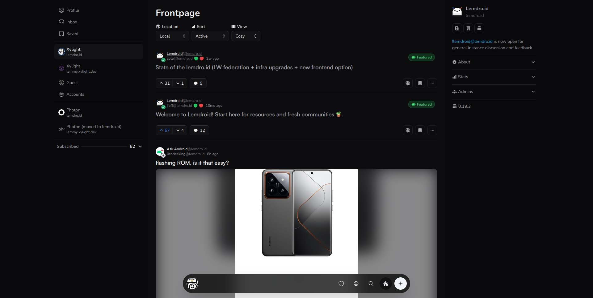
  • Redesign navigation
    • If you dislike the change, go to settings and press "Legacy Navigation Style". This will make the navigation similar to before
    • You can see 5 of the most recent posts and communities for quick access.
  • Use your accent color in more places
    • You can change your accent colors in the theme menu.
  • Improve design consistency
  • New font option
  • Change animation curves to be more bouncy
  • Add option to make featured posts more compact
  • Remove hooks.server.ts to make requests faster

Full Changelog: https://github.com/Xyphyn/photon/compare/v1.28.4...v1.29.0

8


Been using photon for a while now and I really enjoy the minimalistic design!

However, not user about this new floating bar, look very "phone" to me, and I dont really see the utility of having previously-visited posts and communities.

9
1
Gruvbox Theme (i.imgur.com)
submitted 7 months ago* (last edited 7 months ago) by [email protected] to c/[email protected]


I had it made by ChatGPT 3.5, so the theming is not perfect. I don't have the time to mess with this right now.

If you are feeling generous, you may customize it and post the changes in the comment section of this post.

{
  "other": {
    "white": "#fbf1c7",
    "black": "#282828"
  },
  "primary": {
    "100": "#ebdbb2",
    "900": "#282828"
  },
  "zinc": {
    "50": "#ebdbb2",
    "100": "#d5c4a1",
    "200": "#bdae93",
    "300": "#a89984",
    "400": "#a89984",
    "500": "#a89984",
    "600": "#928374",
    "700": "#7c6f64",
    "800": "#665c54",
    "900": "#504945",
    "925": "#3c3836",
    "950": "#282828"
  },
  "slate": {
    "25": "#ebdbb2",
    "50": "#d5c4a1",
    "100": "#bdae93",
    "200": "#a89984",
    "300": "#928374",
    "400": "#7c6f64",
    "500": "#665c54",
    "600": "#504945",
    "700": "#3c3836",
    "800": "#282828",
    "900": "#282828",
    "950": "#282828"
  }
}

10
1
submitted 7 months ago* (last edited 5 months ago) by [email protected] to c/[email protected]


Photon Announces Revamped Design

We're thrilled to unveil a significant redesign of Photon, the user interface for the fediverse! Since its inception, Photon has strived to make the fediverse more accessible with a user-friendly design.

Mono-Light addresses a key request from our community: increased information density. This redesign allows you to view more content at a glance, streamlining your fediverse experience.

Here's a glance at our new design:

As you can see, every UI element has been streamlined while still remaining beautiful. You can see so much more at once, with no sacrifice to usability. Got fat fingers? just cut a bit of it off.

You can expect this new design to roll out by the end of today, April 1st.

...No offense to the mlmym devs. Photon users want a clean UI, while mlmym users want an information dense, old reddit like UI.

11
1
submitted 7 months ago* (last edited 7 months ago) by [email protected] to c/[email protected]


A very minimalist theme, based on the amazing work of https://draculatheme.com/

Red/orange: {"other":{"black":"#23252e","white":"#f8f8f2"},"primary":{"100":"#ff5555","900":"#ffb86c"},"zinc":{"50":"#f8f8f2","100":"#f8f8f2","200":"#ffb86c","300":"#f8f8f2","400":"#f8f8f2","500":"#ffb86c","700":"#23252e","800":"#23252e","900":"#23252e","925":"#282a36","950":"#282a36"},"slate":{}}

Orange/yellow: {"other":{"black":"#23252e","white":"#f8f8f2"},"primary":{"100":"#ffb86c","900":"#f1fa8c"},"zinc":{"50":"#f8f8f2","100":"#f8f8f2","200":"#f1fa8c","300":"#f8f8f2","400":"#f8f8f2","500":"#f1fa8c","700":"#23252e","800":"#23252e","900":"#23252e","925":"#282a36","950":"#282a36"},"slate":{}}

Green/Yellow: {"other":{"black":"#23252e","white":"#f8f8f2"},"primary":{"100":"#50fa7b","900":"#f1fa8c"},"zinc":{"50":"#f8f8f2","100":"#f8f8f2","200":"#f1fa8c","300":"#f8f8f2","400":"#f8f8f2","500":"#f1fa8c","700":"#23252e","800":"#23252e","900":"#23252e","925":"#282a36","950":"#282a36"},"slate":{}}

Purple/pink: {"other":{"black":"#23252e","white":"#f8f8f2"},"primary":{"100":"#bd93f9","900":"#ff79c6"},"zinc":{"50":"#f8f8f2","100":"#f8f8f2","200":"#ff79c6","300":"#f8f8f2","400":"#f8f8f2","500":"#ff79c6","700":"#23252e","800":"#23252e","900":"#23252e","925":"#282a36","950":"#282a36"},"slate":{}}

Synthwave: {"other":{"black":"#23252e","white":"#f8f8f2"},"primary":{"100":"#8be9fd","900":"#ff79c6"},"zinc":{"50":"#f8f8f2","100":"#f8f8f2","200":"#ff79c6","300":"#f8f8f2","400":"#f8f8f2","500":"#ff79c6","700":"#23252e","800":"#23252e","900":"#23252e","925":"#282a36","950":"#282a36"},"slate":{}}

12
1
submitted 7 months ago* (last edited 7 months ago) by [email protected] to c/[email protected]


My favourite theme for Atom/Pulsar by colortom, now available for Photon ;)

{"other":{"black":"#292929","white":"#bfabab"},"primary":{"100":"#db9243","900":"#428a58"},"zinc":{"100":"#6e9ba8","200":"#d3294e","300":"#bfabab","400":"#bfabab","500":"#85af4e","700":"#2c2e33","800":"#2c2e33","900":"#242424","925":"#292929","950":"#292929"},"slate":{}}

Edit: Fixed secondary accent color.

13


Based on the awesome job of [email protected] documenting the stuff and applying it to solarized, I tried to do the same with my vim favorite theme: everforest. It's far from perfect (I'm not at all a designer), feel free to improve your way (and share updates in comments). The zinc theme is probably more refined because I use only this one, I tried to make slate match the palette but as I'm not using it it's more difficult.

A screenshot:

{
  "other":   {
    "white": "#FDF6E3",
    "black": "#002b36"
  },
  "primary": {
    "100":   "#A7C080",
    "900":   "#8DA101"
  },
  "zinc":    {
    "50":    "#D3C6AA", 
    "100":   "#A7C080",
    "200":   "#DBBC7F",
    "300":   "#D3C6AA",
    "400":   "#D3C6AA",
    "500":   "#D3C6AA",
    "600":   "#4F585E",
    "700":   "#4F585E",
    "800":   "#425047",
    "900":   "#232A2E",
    "925":   "#2D353B",
    "950":   "#2D353B"
  },
  "slate":   {
    "25":    "#FDF6E3",
    "50":    "#FDF6E3",
    "100":   "#EFEBD4",
    "200":   "#E0DCC7",
    "300":   "#E0DCC7",
    "400":   "#D3C6AA",
    "500":   "#5C6A72",
    "600":   "#5C6A72",
    "700":   "#5C6A72",
    "800":   "#5C6A72",
    "900":   "#8DA101",
    "950":   "#8DA101"
  }
}
14
1
submitted 7 months ago* (last edited 7 months ago) by [email protected] to c/[email protected]


As there is no documentation (yet), I've done this by trial and error, feel free to tell me if stuff doesn't behave correctly :D

Based on the amazing color scheme by Ethan Schoonover: https://ethanschoonover.com/solarized/

{"other":{"white":"#fdf6e3","black":"#002b36"},"primary":{"100":"#859900","900":"#2aa198"},"zinc":{"50":"#eee8d5","100":"#eee8d5","200":"#d33682","300":"#eee8d5","400":"#eee8d5","500":"#2aa198","600":"#93a1a1","700":"#657b83","800":"#0b3f4d","900":"#073642","925":"#002b36","950":"#002b36"},"slate":{"25":"#fdf6e3","50":"#fdf6e3","100":"#eee8d5","200":"#eee8d5","300":"#eee8d5","400":"#2aa198","500":"#268bd2","600":"#0b3f4d","700":"#0b3f4d","800":"#0b3f4d","900":"#002b36","950":"#002b36"}}

For future reference, here's what I've gathered so far:

Slate (LIGHT)

  • 25: Central window background
  • 50: Global background
  • 100: instance, background hover left bar, pictures background
  • 200: outlines
  • 300: buttons bottom outline
  • 400: ???
  • 500: instance
  • 600: sidebars text color, OP username, post date, reply button
  • 700: ???
  • 800: ???
  • 900: titles, comments, upvote/downvote buttons
  • 950: ???

Zinc (DARK)

  • 50: ???
  • 100: titles, comments
  • 200: upvote/downvote buttons, settings comments
  • 300: post text
  • 400: sidebars text color
  • 500: user instance
  • 600: theme buttons outline (?)
  • 700: button top outline
  • 800: outlines, background hover left bar
  • 900: Buttons, instance, cards background
  • 925: Central window background
  • 950: Global background

Primary

  • 100 Main UI accent color - DARK
  • 900 Main UI accent color - LIGHT

Other

  • Black: ??? Seems to always be black
  • White: card background - LIGHT
15


I don't really like Nord themes so I won't personally use this but here you go:

{"other":{},"primary":{"100":"#8fbcbb","900":"#5e81ac"},"zinc":{"50":"#eceff4","100":"#e5e9f0","200":"#d8dee9","400":"#d8dee9","500":"#e5e9f0","700":"#4f586a","800":"#4c566a","900":"#434c5e","925":"#3b4252","950":"#2e3440"},"slate":{"25":"#eceff4","50":"#e5e9f0","100":"#d8dee9","200":"#d8dee9"}}
16


v1.28.0

  • Add custom theme support
    • Access from the settings page or clicking "Color scheme" in main menu
    • Instance themes are coming later
  • add pasting images directly into comments
  • fix sidebar collapsing stuff

Try a theme

To import/make a theme, go to settings > theming. You can also click "color scheme" in the main menu.

I made a catppuccin theme for photon. Import this:

{"zinc":{"50":"#cdd6f4","100":"#bac2de","200":"#a6adc8","300":"#9399b2","400":"#7f849c","500":"#6c7086","600":"#585b70","700":"#45475a","800":"#313244","900":"#1e1e2e","925":"#181825","950":"#11111b"},"primary":{"100":"#a6e3a1","900":"#7287fd"},"other":{"white":"#ffffff"},"slate":{}}

and voila! This theme only changes dark mode colors right now.

17
1
submitted 8 months ago* (last edited 8 months ago) by [email protected] to c/[email protected]


This theme only works in dark theme for now

Theme (importable in Photon v1.28.0+)

{"zinc":{"50":"#cdd6f4","100":"#bac2de","200":"#a6adc8","300":"#9399b2","400":"#7f849c","500":"#6c7086","600":"#585b70","700":"#45475a","800":"#313244","900":"#1e1e2e","925":"#181825","950":"#11111b"},"primary":{"100":"#a6e3a1","900":"#7287fd"},"other":{"white":"#ffffff"},"slate":{}}
18


This was mostly a bug fix and polish update

  • Fix assymetrical buttons on mobile
  • Make posts that fit maximum height expanded by default
  • Fix and close #248 (Highlighting text and clicking link should wrap text in link)
  • Add community and user banners
  • Performance: make docker server use bun instead of node
  • Migrate to Sveltekit 2
  • Improve post vote hitboxes
  • Add a loading spinner for photon instances where SSR is off
  • and more!

Full Changelog: https://github.com/Xyphyn/photon/compare/v1.26.0...v1.27.0

19


How about embed video in to body post? Can you implement this?

20
1
submitted 9 months ago* (last edited 9 months ago) by [email protected] to c/[email protected]


[options]

๐Ÿ apple ::: This is an example of option 1

๐ŸŒ banana ::: This is an example of option 2

๐ŸŠ orange ::: This is an example of option 3

[/options]

21
1
Photon v1.25.0 (lemdro.id)
submitted 10 months ago* (last edited 10 months ago) by [email protected] to c/[email protected]


What's Changed

  • Add phtn.ngn.tf to the instance list by @ngn13 in https://github.com/Xyphyn/photon/pull/230
  • Upgrade mono-svelte to v0.4.3
  • Redesign main menu
  • Add icon and banners to admin config
  • Fix community settings button appearing when it shouldn't

New Contributors

Full Changelog: https://github.com/Xyphyn/photon/compare/v1.24.1...v1.25.0

22


The Photon community has moved from lemmy.xylight.dev to lemdro.id, because it's getting difficult to have to keep my old instance online.

All updates and questions should go here from now on!